flipping through april’s architectural digest shook the ground beneath my toes.
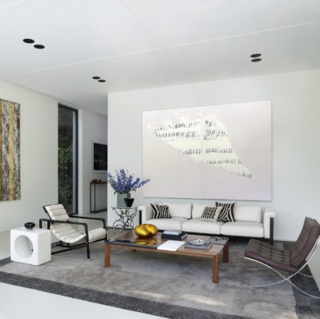
check out the kansas city apartment of hallmark exec david jimenez:
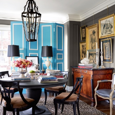
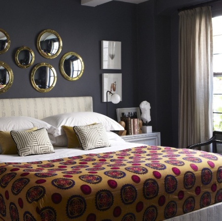
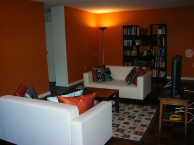
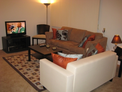
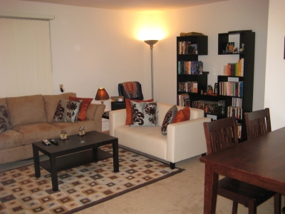
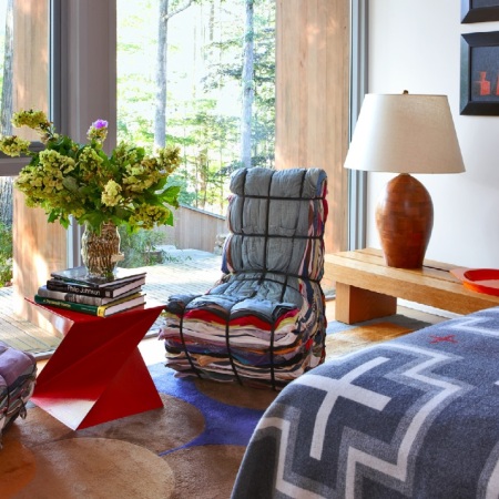
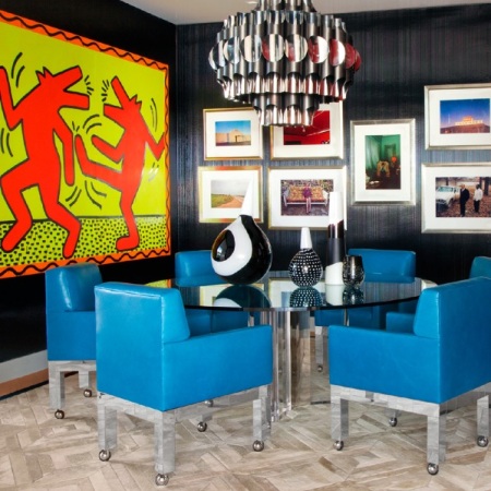
david jimenez / architectural digest / april 2013
david jimenez / architectural digest / april 2013
david jimenez / architectural digest / april 2013
i spent the better part of my college years coveting this aesthetic and the better part of my twenties executing it. take in the layer upon layer of color, texture, detail, sparkle, glamor (…all things out of reach to a nineteen year old occupying a room in a 1950s women’s dorm).
a space is designed with the intention that the eyes of a guest should land on a view and spend seconds or minutes unpeeling it.
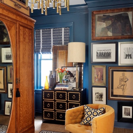
david jimenez / architectural digest / april 2013
after years of broke dorm living, i went to great lengths to coordinate my apartment and carried this taste until now.
now it just looks old to me.
i don’t refer to rooms that purposefully evoke another era or culture, such as alex papachristidis’ baroque manhattan apartment or anouska hempel’s velvety english manor.
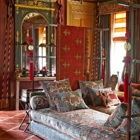
anouska hempel / architectural digest / april 2013
no; i refer to spaces that are contemporary, complex, and serious.
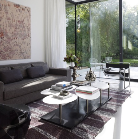
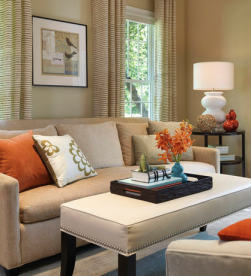
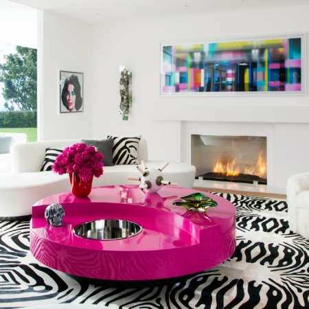
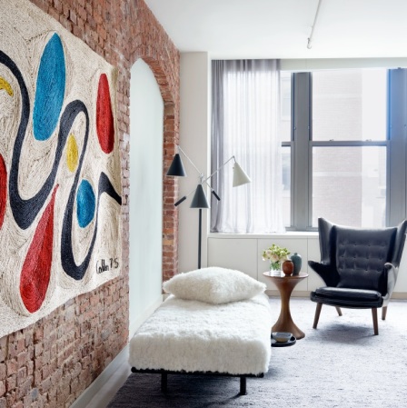
contrast the jimenez apartment with this san francisco beach house belonging to abigail turin.

abigail turin / architectural digest / april 2013
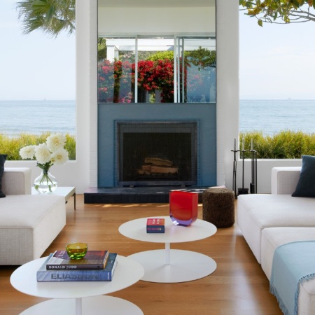
abigail turin / architectural digest / april 2013
these rooms evoke the very definition of youth: smooth, clear skin. bright eyes. a springing step. laughter. energy unconscious of its power.
simplicity. merciful, glorious simplicity.
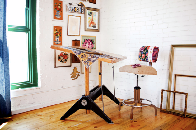
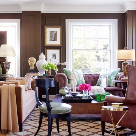
michael formica hits these notes at times around his connecticut home.
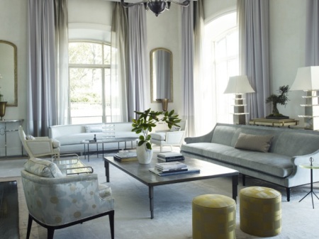
michael formica / architectural digest / april 2013
these guest room chairs make me excited and uncomfortable, much like puppies do:
michael formica / architectural digest / april 2013
i puzzled over this issue of architectural digest to understand what makes a space feel old or young. though living in the same universe as his youthful moments above, some of the rooms in formica’s home stink of ripening 401k portfolios.
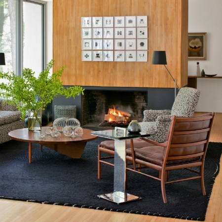
michael formica / architectural digest / april 2013
what’s the missing ingredient? bright pops of colors? is that the secret to a youthful space?
apparently not:
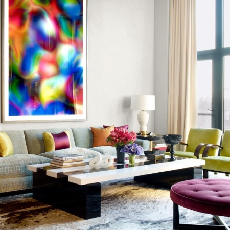
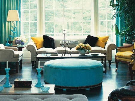
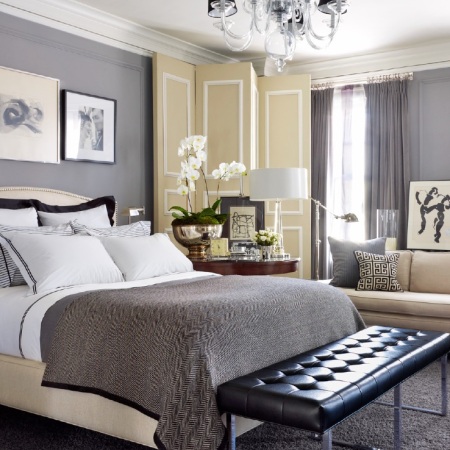
jamie drake / architectural digest / april 2013
jamie drake / architectural digest / april 2013

jamie drake / architectural digest / april 2013
sure, these rooms are coordinated, balanced, and aesthetically good. they also remind me of elton john’s elton-johnish home from last month’s AD.
(i’ll let you decide if ‘elton-johnish’ is a compliment.)
martyn lawrence bullard / architectural digest / march 2013
martyn lawrence bullard / architectural digest / march 2013
these photos make me want to chuck my ipad across the room.
so pops of colors + white walls does not a youthful interior make. what, then??
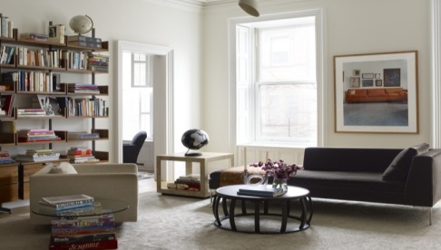
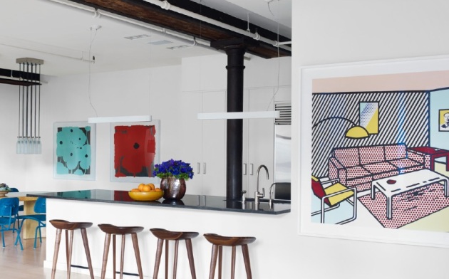
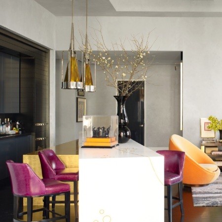
…whatever it is that’s going on in will ferrell’s manhattan apartment:
shawn henderson / architectural digest / march 2013
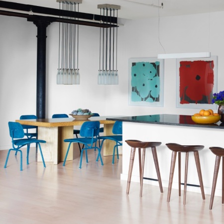
shawn henderson / architectural digest / march 2013
shawn henderson / architectural digest / march 2013
casual ease? yes, that’s what i’ll name her.
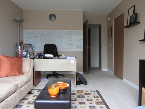
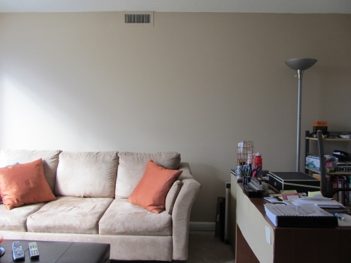
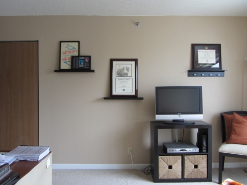
brightness + pops of color + casual ease. this is Me Right Now.
i share these musings not to be the jerk who criticizes personal style. if a home dweller consciously plants her style on a space, i respect. period.
what throws me is the backwards journey i’ve taken from the layered wisdom of jimenez to the youthful whimsy of turin. it’s disconcerting. and yet…
my parents spent this week visiting us in detroit. they shared, with enthusiasm, their continuing adventures thanks to a renewed energy for life and a willingness to leave behind the seriousness of their parenting years.
they said: when i was 20 i thought like i was 60, and now that i’m 60 i live like i’m 20.
is this the new direction of my design tastes?
i’ll take it.